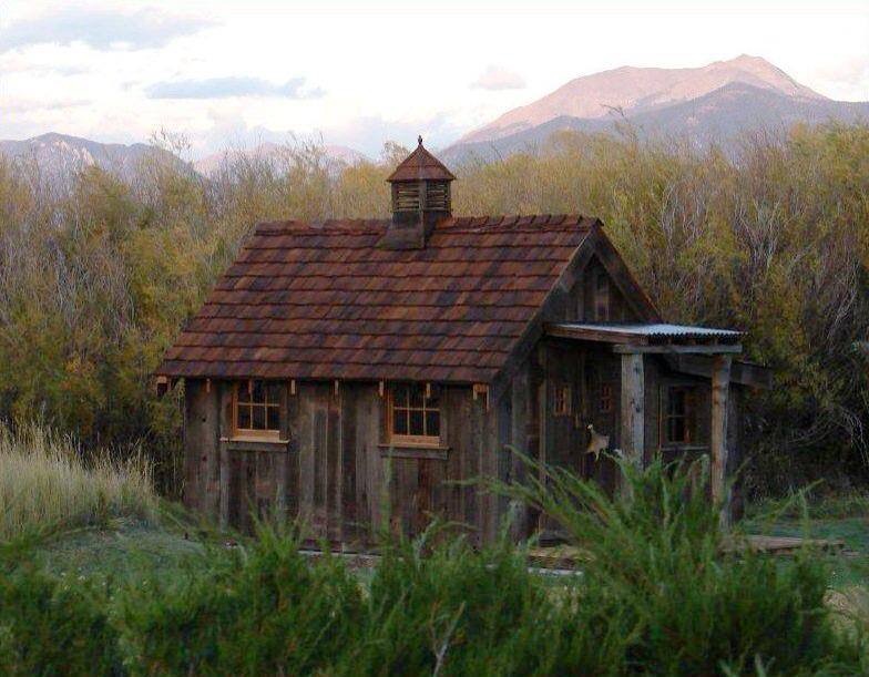
Such a nice little cottage.
She is “all-natural” and blends into the environment well.
She is also a great starter home, the perfect shape that can be added on to in the future when the need arises.
But there is one shortcoming to this home (hey, it’s what I do… look at houses… and learn from them… pro and con). The cabin is too short… her walls should have been taller. My best guess is that these walls appear to be seven feet tall. Notice how the roof encroaches upon the windows which are already too squatty themselves. And how the door was forced to be put on the end of the home and how the landing roof above that door overpowers the home.
I’m a big fan of a house design where some part of the home’s roof comes down low, where people can see and appreciate the quality of the roof that covers the entire home, maybe even so low in a place where they can touch it, but that is best served with a small addition off of the main structure.
Yes, by using eight or ten foot studs in the walls (which would have cost only a few dollars more) this home would have been more human-scaled and versatile (a porch could have been added on the front, and a loft area would have been created, if desired).
I would love to know the story behind the design of this home and how using seven foot studs came about (most unusual). I would venture to say that the landing roof on the end was not drawn onto the plans… If it had of been I think this situation would have been caught and corrected on paper. Ahhh yes, the importance of elevation drawings. I learned this lesson myself years ago in building one of my own houses… hey, I thought, if it’s built with natural materials it has to look good right?? lol
Originally posted 2016-02-26 14:58:13.


Take a look at this design and roof line from Dan Joseph Architects;
http://www.djawest.com/beaver_creek.htm
Rocky Mountain high!
It’s certainly not my style, it’s more of a National Park look… which is kind of cool in it’s own way.
I could see vacationing here for a week with a large extended family gathering… but somehow the place would never feel like home to me.
I really appreciate the way the architect has drawn the home to appear as if the cabin has grown out of the ground, a very organic look… it reminds me of the Craftsman look of Greene and Greene.