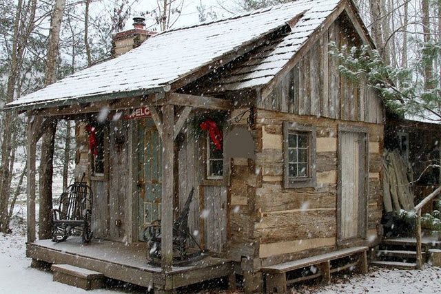
For the record I didn’t build this cabin, nor did I design it. I wish I knew who did… I’d give them a tip of the old hat.
This cabin breaks a lot of the rules that I have placed on my own projects. The front porch is too small. The front of the cabin is not log, but rather switches over to paneling. The porch posts have structurally unnecessary angle braces. There is a door located in the gable end of the cabin, and there is vertical paneling above it rather than the traditional lap siding. And, there is a pretty unusual porch roof in the way it goes way up onto the cabin roof. With all these “rule-breakers” I shouldn’t like this cabin… but the fact is, I do. And, I do a lot.
So, what’s up with that?
First of all, there are no “rules” (I need to keep that in mind). There are proven things that work. And, on the other hand, there are features that often turn out to be mistakes or eyesores. But the fact is that sometimes proven things are boring, and unusual out-of-the-norm things turn out really well. Go figure.
So, why is this cabin so darn cute?
Yes, of course, small things are often cute… kittens, puppies, children… and tiny houses. Got that.
And, this cabin has some nice logs, along with other natural materials and tasteful decorative touches.
But, it turns out that the “rule-breakers” are what adds to the charm of the home.
I believe a porch that would have been built any larger than this would have been distracting… perhaps overwhelming. This porch works thanks to it being so low to the ground, it’s almost as if it is part of a much larger patio that is the woods with a small sheltered roof above the rocking chairs.
And, how about that porch roof that goes all the way up the cabin roof? It actually looks good, whereas a shorter, more typical one over that tiny porch would have looked stubby. Who likes “stubby”?… no one, that’s who.
The paneled siding on the front of the cabin eliminated the need for more logs (sometimes in short supply), and it provides more visual interest. It blends with the logs rather than contrasts… unlike say painted paneling or stone facade that wouldn’t.
By putting vertical siding on the gable end of the cabin the cottage now looks… well, taller… a nice enhancement. Tiny houses shouldn’t be squatty, tiny houses should be tall. (There I go with making rules again. lol… but I’m right on this one, probably)
I have found that the gable-end of a cabin, the one that has a chimney on it, is often the most attractive side of a cabin… but the end opposing the chimney is often plain and boring in comparison. By adding a door on this end the cabin has more visual interest. It’s as if the home now has two front profiles.
I learn so much from looking at the work of others. My work gets better… and it keeps me humble.
Artists often learn their trade by first studying the works of those that come before them and from their peers. Builders should too.
Originally posted 2016-03-05 15:36:36.


I am a single lady I have a 15 year old son I would so love to have a home just like this post
I was fifteen years old when my dad came up with the idea of building his home. He had never built a house before, and I wasn’t too thrilled with spending my summer carrying lumber. But we pulled it off… he acquired a nice home at a bargain price. And I, who swore I never do that again, would look back on that time as my apprenticeship. You can do it too. I would later at the age of 20 with no money, no credit, and only that one experience, go on to build a house for myself. It’s all about taking one step at a time.
By your detailed observations I can tell you know your field. Damn good article.
Cheers, Christine
Thank you Christine!… one of the highest compliments I’ve ever received!