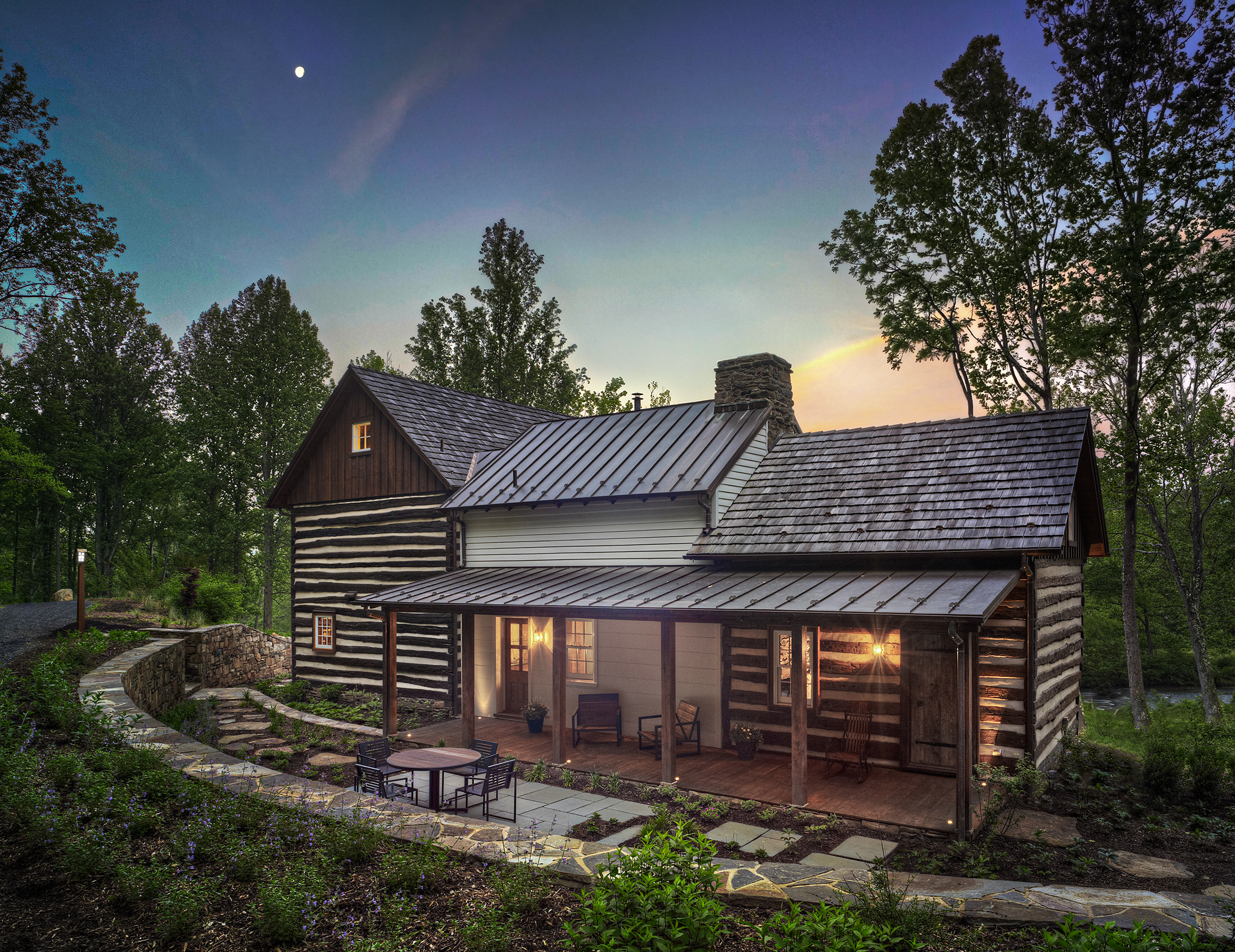
What a nice log house!
This home is a great example of how a large home can be made from two smaller log cabins. I especially like the addition of the central sided area which provides visual contrast as well as extra living space… a different “feel” has been created inside and out, and, at a reduced price per square foot than the log sections.
And, who doesn’t love that long porch?
If I had designed and built this home I would have made three changes, that I feel would have made this home perfect…
The home lacks the presentation of an exterior stone chimney, something we have come to expect to see on a log home… I would have placed one on the log section to the left in this image.
I would have also added more windows, one on each side of that added chimney… on both floors… and two more windows added on the framed section, above the porch roof.
And finally, I wouldn’t have aligned these three sections of the home so flush with each other on this side of the home. By stepping back each section a couple of feet this home would have developed much more character… more depth… and then each section would have not only blended with each other, but would have been appreciated for it’s uniqueness.
Originally posted 2015-12-30 14:25:48.


No window above the porch on the middle section, is most notable.
I don’t know why they don’t step back the add ons? Thats how it would have been done originally.