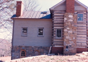
Here’s the other side of this incredibly nice home.
Who wouldn’t want a place as sweet as this?
But once again, there are a few details that make me cringe, that make me drop this cabin’s grade from an A to a B.
I’ll give the skylight a pass. A lot of people love these things. They can create some nice lighting effects, but boy do they tend to leak and they are a royal pain to clean.
If you look at the stonework on the chimney it appears as if the mason just gave up trying to properly lay the stone on the top six feet before he reached the brickwork. I’m not certain if he ran out of quality stone, or was losing money on his fixed bid, or was having problems in his personal life… but whatever it was it is clearly reflected in this chimney and will be forever.
Next up is the attic vents. These weren’t that noticeable in the previous photo due to shadows, but over here in the full sunlight we see these huge triangles. Vents that belong more on brick rancher than a vintage log cabin. I would have either vented behind the chimney, or put in vents that appeared to be two small windows, or not vented at all and simply made the attic space part of the conditioned interior.
There were no original windows in the end of this cabin. Both windows that you see in the photo were drawn in by the architect. I don’t know about how other’s view this but I find the diagonal placement of the windows to be distracting.
I would think no windows would have been fine. I would think four windows would have been better. I would think two windows on either floor would work. I would think two windows on either side of the chimney would have worked. I would think one window anywhere would have been fine. In other words… there are many pleasing ways the windows could have been designed into this cabin, and only one way to locate them wrong… and that, of course, is the way they were drawn. lol
Originally posted 2015-06-19 19:31:27.

