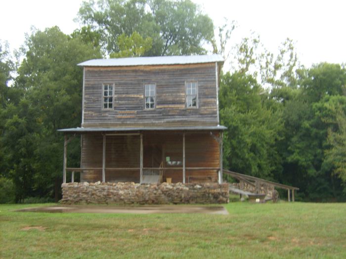
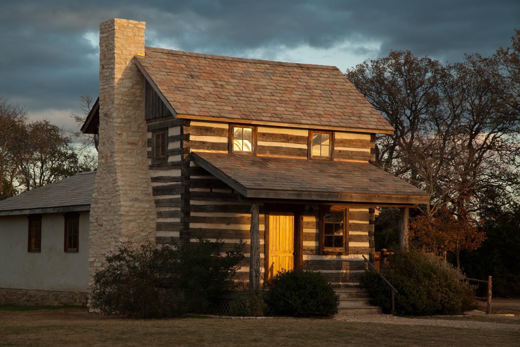
Today I’d like to focus on the second floor windows of these two homes.
Actually, the windows themselves are fine, but there is a problem with the second floor profiles of these structures.. An oversight has been made that visually detracts from the potential charm that these two houses could have offered.
The first home, an old frame structure appears odd in it’s presentation, doesn’t it? This oddness comes from the second floor area. But exactly what is the problem? And how could it have been built differently?
The second home (a newer log cabin built using antique logs) appears to have a visually overpowering porch roof. And yet this roof is not inappropriately too large. So again, what’s the problem?
It turns out that both houses suffer from the same aesthetic design “issue”, each displaying opposite extremes of the same problem.
I have found that the front profiles of houses look best when there is about an eight inch space between the second floor windows and the roofs above and below… any wider of a space and the house looks odd, as if the windows are floating above the porch roof… and any less of a space and windows look “crunched” and the porch roof below becomes visually overpowering.
It’s a simple design consideration, it doesn’t cost any extra money to implement, but one that makes a big difference.
Originally posted 2015-12-10 13:52:49.


