House Design 101

outside1

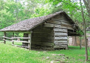
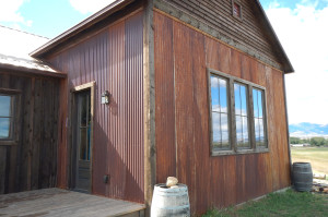
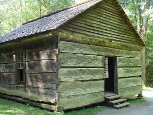
I was so concerned when it came time to design and build an addition for this precious cabin that I had built five years prior.

I was increasing the square footage of the house by nearly four fold… it would have been so easy for the cabin to have been visually lost.

I wanted to honor that sweet little structure, not kill it.

I think I did pretty well.

What do you think?

Originally posted 2015-06-01 15:04:04.

House Design 1012019-06-29T10:16:55+00:00

House Design 101… part 4

inside1

And you know, everyone just loves that bow window.

The homeowners tell me that visitors tend to stand around that window and just gaze out at the view for the longest periods of time. And, that this window is the “go to window”… when something is happening outside this where everyone flocks too.

That window is there because the designer (me) wasn’t too proud to admit that he could have done better. And it’s there because the builder (also me) was onsite everyday making sure that when the house was finished that were be no regrets.

Regrets are terrible things.

Avoid them whenever possible.

Originally posted 2015-06-01 14:51:37.

House Design 101… part 42019-06-29T10:16:54+00:00

House Design 101… part 3

00001580

There are two things that I’d like to point out in this image…

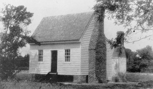
First, notice that I had the men tack up an outline for the future chimney on the new addition’s exterior wall. This chimney had to be perfect. I had styled it on the plans to do my best to make it look the chimneys that are commonly seen in the southeastern part of the state of Virginia… (the area where this timber frame section had come from).

I was pleased with what I saw. I could see that I would be happy with the chimney. And the crew was pleased that I was pleased. 🙂

And then the second thing I’d like to reveal… it’s kind of hard to see in this photo… notice that we had framed in two window openings in the connector area (the area between the log cabin and the new timber frame addition). Those two windows looked great in my drawings. I was so pleased with them.

Everybody loved them.

But when I went inside that space, in what would be the future dining room, I was disappointed with the affect of looking out these small windows at the grand mountain view that rolled out before my eyes.

I went back outside and grabbed a lawn chair, you know, one of those cheap plastic ones from Walmart, and I sat right there where this photo was taken and stared at this house until the answer came to me….and that was… that a large bow window should go in this area.

The crew was amused, and the owners were somewhat shocked on their next visit to the jobsite when we had gone ahead and changed this wall.

But it had to be done.

A man’s gotta do what a man’s gotta do.

Originally posted 2015-06-01 14:37:03.

House Design 101… part 32019-06-29T10:16:53+00:00

House Design 101… part 2

livingroom1

That window, the one that I mentioned in my last posting, would have been to left of this fireplace.

It would have let more light into the room (but once we had the walls framed up we could see that more light was not needed).

There would have been a nice view out of that contemplated window… but it would have been a small portal, and besides, that same glorious view could have been seen through other windows in the home, and, from both porches.

I felt that the addition of this window from the outside perspective would not have been ugly, but it would have created a bit more visual “bizzyness” than what I wanted to see in this area.

There is great beauty to be found in simple things.

A window added here in this location would have also taken up valued wall space for future bookshelves that the client owned.

And finally, there was the added cost in this change. We had plenty of other options in this project to blow the budget. Why start here?

So the window consideration was dropped.

Originally posted 2015-06-01 14:15:05.

House Design 101… part 22019-06-29T10:16:52+00:00

House Design 101… part 1

00001584

I’m going to share with you in my next five postings one of the biggest secrets that I can offer with regard to designing an attractive home.

Shhhhh, don’t tell anyone.

Let’s call this posting… House Design 101… part 1

When I draw a set of plans for a home, my focus is always on the elevations (profiles), not the floorplan. I want to see what the house will look like when one arrives home. That’s not the standard practice of many design firms who focus on room layout and traffic flow.

I want my houses to look good from the outside… I’ve always found that getting the inside to look good is easy… combine nice windows, the best materials, skilled craftsmen, and talented decorators, and Wallah! any interior space can pop.

I’ve also observed that in most houses, built by others, that once the plans are complete and construction has begun, any additional thought or consideration to the appearance of the outside of the house is completely ignored. To make a change at that point would cost additional money, and it might indicate that the designer had made mistakes in his design. You know, a pride issue.

I’ve got no ego in that department. I just want my houses to be as good as I can make them.

The fact is that a house is different than a drawing of a house. A structure that you walk around in…. one that you can walk through… is no longer an idea on a piece of paper.

Notice in this photo… the piece of plywood that is tacked to the wall at the top of the ladder? The idea of adding a window to the side of the chimney was being discussed at this time.

I needed a visualization to see how it would look.

Originally posted 2015-06-01 13:49:15.

House Design 101… part 12019-06-29T10:16:51+00:00

The Ruth house… part 21

office1

A home office should have a “comfy place”… where guests or clients can feel valued and “at home”… or in the event that one should ever wish to get away the desk for a moment to gather their thoughts.

I like all the natural light that pours in through the dormer behind the couch… it’s so much better than the light provided by florescent tubes.

Originally posted 2015-05-31 14:03:57.

The Ruth house… part 212019-06-29T10:16:50+00:00

The Ruth house… part 19

00001586

I had salvaged a two-story timber-frame that was nearing collapse, but my plans called for a steeply pitched one-story home.

I put back the first-story of the structure as she had originally been built and then I used all the bonus floor joists from the second floor to create a timbered rafter system.

This newly created space quickly became my favorite part of the home.

Originally posted 2015-05-31 13:27:57.

The Ruth house… part 192019-06-29T10:16:48+00:00

Daniel Boone was a man

boon

Here’s Daniel Boone’s log cabin… built in 1795 and still standing in Kentucky… amazing.

Originally posted 2015-05-30 15:49:33.

Daniel Boone was a man2019-06-29T10:16:47+00:00

The Ruth house… part 18

timelessrenewal1-7

Most people, when they think of a home built using a timber frame, they envision a huge barn-like structure with vast cathedral type ceilings… but that is not always the case… a timber frame can create a very cozy space.

Originally posted 2015-05-30 11:42:03.

The Ruth house… part 182019-06-29T10:16:46+00:00
Go to Top