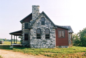
This little house would serve as a vacation getaway home for a family that lived out of state. One day in the future they would retire and move full-time to this property and at that time they would add-on a bit more square footage.
If there is such a thing as “a typical client” for me, that would be the definition of them. It seems that there is no shortage of people living in colder, urban areas who dream of one day relocating to the rural Virginia countryside.
It is hard to top the beauty of a home that is part log, and part stone. It’s an unbeatable combination. Both speak to the soul that there is safety and warmth to be found within these walls.
I was so pleased with the drawings that I put together for this house that I used an ink profile of it for my company’s logo. One day I’d like to build this home again… with just a few adjustments made.
In this photo the first thing that I notice are the stone arched windows in the dining room addition. Off of the back of this cathedral ceiling room is a lean-to “kitchenette”… a fully functional, but very small, kitchen.
Let me point out that I never pick colors on any of my projects. I always leave that up to the homeowners. I feel it’s a matter of personal choice, and so I do my best to remain silent during the selection process (although I will express my opinion if pressed).
Now, for the record, I like the color red.
And, I like this shade of red… it would be wonderful on a piece of furniture.
But, I would not have used it here on this house. I find that the stonework and the logs are enough “fireworks” for any house and that the red in this situation is drawing far too much of my eye’s attention.
Of course, no one is a worse critic of a piece of art than the artist that made it. I guess that’s true of builders too.
Originally posted 2015-03-20 15:31:59.

