Flooring… character vs perfection
What do you think of this stone floor?
Certainly it’s very attractive.
But would it be too “textured” for your daily use?
I once encountered a woman who told me her tale of woe, how she was living in her new home and that a gap had appeared between two of her floorboards (about an eighth of inch). She told me of her frustration that her builder had not come back to repair or replace the flooring in that room because of this issue. She was pondering suing the builder and asked my opinion. My only response for her was to be thankful that only one board had such a small gap in her house, that her house contained thousand of pieces of wood whose behavior was beyond the control of the man who installed them.
It’s issues like this why so many good builders close their doors.
Originally posted 2016-01-01 17:12:07.
An excellent source of stone
Originally posted 2015-12-31 10:54:54.
Another three-section log home
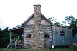
Here’s another three section log home to go with the one posted yesterday.
This house has great definition between the three sections thanks to the middle section being recessed.
But like the other log house she is in need of a stone chimney or two… and porches… where are the porches?… gotta have porches!
Originally posted 2015-12-31 10:29:48.
Making a good cabin great
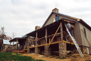
What a nice log house!
This home is a great example of how a large home can be made from two smaller log cabins. I especially like the addition of the central sided area which provides visual contrast as well as extra living space… a different “feel” has been created inside and out, and, at a reduced price per square foot than the log sections.
And, who doesn’t love that long porch?
If I had designed and built this home I would have made three changes, that I feel would have made this home perfect…
The home lacks the presentation of an exterior stone chimney, something we have come to expect to see on a log home… I would have placed one on the log section to the left in this image.
I would have also added more windows, one on each side of that added chimney… on both floors… and two more windows added on the framed section, above the porch roof.
And finally, I wouldn’t have aligned these three sections of the home so flush with each other on this side of the home. By stepping back each section a couple of feet this home would have developed much more character… more depth… and then each section would have not only blended with each other, but would have been appreciated for it’s uniqueness.
Originally posted 2015-12-30 14:25:48.
The chimney betrays the era
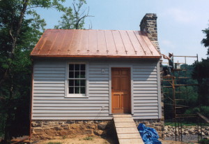
She is a cute cabin… rustic and simple.
The men who restored her did a good job… they replaced the bottom log (the sill), the chinking was applied correctly (recessed), and the tin roof is a nice touch in keeping her modest in appearance… a working family home of the mid-1800’s and beyond.
My only disappointment is the chimney… the masonry “veneer over cinder-block” is given away by the random pattern of the stonework and the running bond pattern of the brick. I don’t mean to be critical, but imagine a time in the future when cabins will be restored and the chimneys will be re-built out of plastic that “looks like” stone and brick… I’m sure many will love it… but those with a keen eye will likely comment “what the heck is that?”…”couldn’t they have found someone who could have built it the way it was built?” lol
Originally posted 2015-12-30 13:37:46.