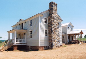
The width of a porch

IMG_1961

This attractive log home fascinates me.

One of the many design “rules” in building an attractive log home is to properly size the front porch of a cabin.

Through decades of observing  old log homes, and in building traditionally designed new ones, I have observed that…

A six foot porch, which is common on many new homes built today, is unheard of and impractical on a country cabin because it is simply too small to be useful.

Whereas, an eight foot porch is ideal, being visually appealing and offering plenty of room for rocking chairs, porch swings, and guests to stand on.

A wide ten foot porch is rare and often too large, appearing somewhat awkward and overbearing on any cabin other than the very largest of ones (20 feet or wider). These oversized “ten-footers” do offer the benefit of abundant exterior space, enough that a picnic table or even sleeping cots can be set up, and thus an outdoor space can practically become an exterior room.

As useful as these wider porches are I have often encouraged people to stick with the traditional eight-foot porches.

But here on this cabin we have what appears to be a unheard of fourteen-foot porch!

I can think of no other cabin like it.

If someone had told me of such a thing without seeing this image I’d probably have chuckled at the idea of how odd it must look.

But I would have been wrong… this cabin looks great!

Perhaps, rules are meant to be broken.

And, that when one breaks the rules, they need to be bold about it!

Originally posted 2015-12-12 16:40:32.

The width of a porch2019-06-29T10:05:26+00:00

Siting a home on a property

IMG_1715

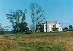
I believe that more than half of the parcels of land that I have built on over the years have been half wooded and half cleared… these are easy properties to pick the house site as a cabin looks best when it is nestled close to the tree line where field and woods meet, much like you see here in this image.

Here we have “His” and “Hers”  cabins.
But, which is which?  🙂

Originally posted 2015-12-12 15:17:06.

Siting a home on a property2019-06-29T10:05:25+00:00

Good fencing

IMG_1718

There’s a lot to be admired about a home that has good fencing.

A new home built on a raw piece of land tends to be a little bit out of place until outbuildings and a perhaps a bit of fencing is added. These extras tend to anchor a home to the environment.

Originally posted 2015-12-12 14:54:59.

Good fencing2019-06-29T10:05:24+00:00

How not to repair a leaning chimney

IMG_1916

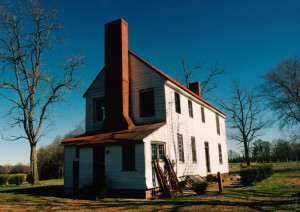
Here we have an old cabin with wide hewn logs.
Unfortunately, the chimney appears to be “on the move” (likely do to a combination of an improperly built footer under the chimney and poor drainage around the cabin).
There is a sign near the front door that states that this cabin is the property of the US government which I suppose explains the useless attempt to hold the chimney in place by nailing a few 2×4’s around it.
This chimney could quite possibly be lifted back into place and properly stabilized by professionals.

Originally posted 2015-12-12 14:42:10.

How not to repair a leaning chimney2019-06-29T10:05:23+00:00

One year anniversary!

IMG_1521

Oh my… one year ago the first posting was made here at Handmade Houses!
And, at the time… no one read it.
Yes, it got zero response… nothing but crickets chirping in the background.
Since then over 1,000 posts have been made and this wonderful community has grown to over 48,000 members!
Wow! Give yourself a pat on the back!
I have a hard time imagining what a gathering of that size would look like, but I do take great comfort knowing that I’m not the only one who dreams of owning the perfect handmade home.
Thank you… each and every one of you… for your support, for your encouragement, your likes, your comments, and your shares.
It means a lot to me.
I spent the first eight months or so sharing the stories and the steps in building some of my favorite projects. And the last few months I’ve been posting photos of houses that inspire me to do better. I hope that you have enjoyed them and have gotten something out of them. There is more to come!
I’ve greatly enjoyed your comments and have learned a lot from you all as well. Thank you for sharing.
I’ve gained a lot of new friends too.
Life is good.
This photo was the most popularly received image of the year, having been viewed by over a half a million people. Unfortunately, this cabin was not built by me… go figure… what’s up with that guys? lol!!! Are you trying to keep me humble or something?
Thanks once again for all your support!
Noah
 

Originally posted 2015-12-11 17:29:39.

One year anniversary!2019-06-29T10:05:22+00:00

A very nice primitive cabin

IMG_1943

At one time this was likely the most common home found in this country.

Originally posted 2015-12-10 19:57:32.

A very nice primitive cabin2019-06-29T10:05:21+00:00

Just the basics

IMG_1720

A log home and a team of mules… life is good.

Originally posted 2015-12-10 19:46:23.

Just the basics2019-06-29T10:05:20+00:00

Two houses, two extremes


DIGITAL CAMERA

IMG_1713

Today I’d like to focus on the second floor windows of these two homes.

Actually, the windows themselves are fine, but there is a problem with the second floor profiles of these structures.. An oversight has been made that visually detracts from the potential charm that these two houses could have offered.

The first home, an old frame structure appears odd in it’s presentation, doesn’t it?  This oddness comes from the second floor area. But exactly what is the problem? And how could it have been built differently?

The second home (a newer log cabin built using antique logs) appears to have a visually overpowering porch roof.  And yet this roof is not inappropriately too large. So again, what’s the problem?

It turns out that both houses suffer from the same aesthetic design “issue”, each displaying opposite extremes of the same problem.

I have found that the front profiles of houses look best when there is about an eight inch space between the second floor windows and the roofs above and below… any wider of a space and the house looks odd, as if the windows are floating above the porch roof… and any less of a space and windows look “crunched” and the porch roof below becomes visually overpowering.

It’s a simple design consideration, it doesn’t cost any extra money to implement, but one that makes a big difference.

Originally posted 2015-12-10 13:52:49.

Two houses, two extremes2019-06-29T10:05:19+00:00

Fireplace hanging skillet

IMG_1957

There’s an extra biscuit on the skillet… anybody interested?

Originally posted 2015-12-10 12:58:01.

Fireplace hanging skillet2019-06-29T10:05:18+00:00

Overhanging roof

IMG_1469

This cabin’s overhanging roof creates a sheltered exterior space.

Originally posted 2015-12-10 12:42:32.

Overhanging roof2019-06-29T10:05:17+00:00
Go to Top