Wood working shop… part 2

00002684

That’s Zeke at the top of the ladder.

For many years he was part of the crew.

I don’t suppose many construction companies would allow a dog on site, and I understand that, but Zeke was more than a dog, he was an unpaid member of the team.

I did give him a treat occasionally though (when his owner wasn’t looking) (I think everybody else on the crew did too)

Originally posted 2015-06-04 14:21:50.

Wood working shop… part 22019-06-29T10:17:01+00:00

Wood working shop

00002681

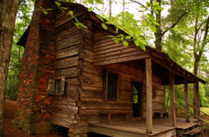
I once received a call from a man who had sold salvage rights to an old house that he had on his farm. The buyer of those rights had come in and extracted the highly-valued, easily-removed items including… the mantles, flooring, interior doors and locks, and the wainscoting… and then left the rest for the farmer to burn down.

I would say this is the case in half the calls I’ve gotten over the years. There is no shortage of individuals seeking to salvage for the sake of the easy materials and the quick money, and only a few who are interested in preserving the individual house and it’s history.

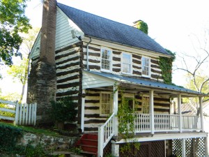
I would have loved to have rebuilt this old gal just like she was… but I didn’t have that option. But her frame, dating to the 1830’s was mighty fine, so I worked out a salvage purchase price for the abandoned shell and dug in, knowing that a client would soon appear wanting something just like this.

And none appeared.

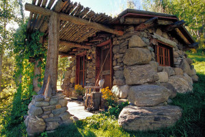
So, I accepted this as destiny, that it was at long last, after many years, time to build my dream wood-working shop.

Originally posted 2015-06-04 13:50:28.

Wood working shop2019-06-29T10:17:00+00:00

An early 20th century home… part 2

00002547

I’ve really loved my job… all these years of witnessing old houses. From the louvered doors seen on this addition “out back”… to the special decorations often found like the spare tires that leaned up against the porch.

00002538

00002546

Originally posted 2015-06-03 13:25:48.

An early 20th century home… part 22019-06-29T10:16:58+00:00

An early 20th century home

00002545

I really loved this farmhouse.

This was a house that quickly felt like “home”.

She is the finest example of the very end of an era of exceptional American homes.

00002539

Built in the very early 20th century, almost all traces of timber framing had vanished. There were no axe-shaped beams of wood within her walls. Plastered walls and one-board wainscoting were now a thing of the past.

But, she was beautiful. Her style and proportions still echoed the past. Materials of high quality and workmanship were found throughout.

00002544

If someone asked me to design them a house similar to an old farmhouse… this would be one of my references.

Originally posted 2015-06-03 13:11:49.

An early 20th century home2019-06-29T10:16:57+00:00

An energy efficient home?

EEH_2011_C1200w

I must admit that the first time I saw this magazine I chuckled out loud. Now don’t get me wrong, I was flattered that a home that I had designed and built had made the cover of a magazine… but on a special issue from the folks at Timber Home Living on Energy Efficient Homes?

I do my best to build a tight house, to insulate and caulk everywhere that I can. Stress skin panels and spray-in foam are unmatched in their insulating capabilities but there are two features of my homes that I must confess should eliminate my work from the cover of such a magazine.

First of all, most of my clients, myself included, love having an old antique door for their front entrance. They are beautiful and add so much charm to a house. They also never completely keep the outside air where it is supposed to stay. I can get them tight with an hour or two of fussing, but as soon as the temperature or humidity changes they either don’t close properly, or there is air infiltration leaking around them.

And the second reason for my disqualification is that old log cabins are not air tight… I don’t care how much effort one puts into getting them sealed… and believe-you-me I try harder on each successive one that I build to get them as sealed as much as I can, but when the wind and rain are hollering outside, air is going to find it’s way in.

There is a reason they don’t build submarines out of logs.

I should make myself clear… my homes are very comfortable, the air leakage found around old wood is minimal, not even noticeable unless you are looking to find it. And besides… I don’t agree with the current trend of making a house so tight that there is no air exchange. I don’t think it’s healthy to continually re-breath the same air, air that is contaminated from all the products within the home.

We, at the Bradley home, open the windows and doors wide on every pretty day to let that outside air in. Anyone else an open window fan?

Originally posted 2015-06-02 14:26:32.

An energy efficient home?2019-06-29T10:16:56+00:00

House Design 101

outside1

I was so concerned when it came time to design and build an addition for this precious cabin that I had built five years prior.

I was increasing the square footage of the house by nearly four fold… it would have been so easy for the cabin to have been visually lost.

I wanted to honor that sweet little structure, not kill it.

I think I did pretty well.

What do you think?

Originally posted 2015-06-01 15:04:04.

House Design 1012019-06-29T10:16:55+00:00

House Design 101… part 4

inside1

And you know, everyone just loves that bow window.

The homeowners tell me that visitors tend to stand around that window and just gaze out at the view for the longest periods of time. And, that this window is the “go to window”… when something is happening outside this where everyone flocks too.

That window is there because the designer (me) wasn’t too proud to admit that he could have done better. And it’s there because the builder (also me) was onsite everyday making sure that when the house was finished that were be no regrets.

Regrets are terrible things.

Avoid them whenever possible.

Originally posted 2015-06-01 14:51:37.

House Design 101… part 42019-06-29T10:16:54+00:00

House Design 101… part 3

00001580

There are two things that I’d like to point out in this image…

First, notice that I had the men tack up an outline for the future chimney on the new addition’s exterior wall. This chimney had to be perfect. I had styled it on the plans to do my best to make it look the chimneys that are commonly seen in the southeastern part of the state of Virginia… (the area where this timber frame section had come from).

I was pleased with what I saw. I could see that I would be happy with the chimney. And the crew was pleased that I was pleased. 🙂

And then the second thing I’d like to reveal… it’s kind of hard to see in this photo… notice that we had framed in two window openings in the connector area (the area between the log cabin and the new timber frame addition). Those two windows looked great in my drawings. I was so pleased with them.

Everybody loved them.

But when I went inside that space, in what would be the future dining room, I was disappointed with the affect of looking out these small windows at the grand mountain view that rolled out before my eyes.

I went back outside and grabbed a lawn chair, you know, one of those cheap plastic ones from Walmart, and I sat right there where this photo was taken and stared at this house until the answer came to me….and that was… that a large bow window should go in this area.

The crew was amused, and the owners were somewhat shocked on their next visit to the jobsite when we had gone ahead and changed this wall.

But it had to be done.

A man’s gotta do what a man’s gotta do.

Originally posted 2015-06-01 14:37:03.

House Design 101… part 32019-06-29T10:16:53+00:00

House Design 101… part 2

livingroom1

That window, the one that I mentioned in my last posting, would have been to left of this fireplace.

It would have let more light into the room (but once we had the walls framed up we could see that more light was not needed).

There would have been a nice view out of that contemplated window… but it would have been a small portal, and besides, that same glorious view could have been seen through other windows in the home, and, from both porches.

I felt that the addition of this window from the outside perspective would not have been ugly, but it would have created a bit more visual “bizzyness” than what I wanted to see in this area.

There is great beauty to be found in simple things.

A window added here in this location would have also taken up valued wall space for future bookshelves that the client owned.

And finally, there was the added cost in this change. We had plenty of other options in this project to blow the budget. Why start here?

So the window consideration was dropped.

Originally posted 2015-06-01 14:15:05.

House Design 101… part 22019-06-29T10:16:52+00:00
Go to Top