Quality vs Quantity
Oh my.
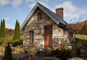
She is so fine.
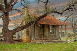
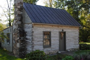
When contemplating the design and construction of a home, the first decision to be made is “quality vs quantity”.
The owner of this small stone home chose the highest level of quality. They could have had a vinyl clad home, twice as large as this one, for the same price.
It’s a tough choice to make.
Living small is challenging, while living large is so tempting.
We naturally want both, quality and quantity, but few people have the financial resources for a large home built as well as it can be.
So, is quality worth the cost?
Originally posted 2015-10-04 16:55:45.
Trees and log cabins
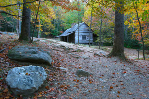
Trees have a tendency to sneak up on log cabins… sometimes they even try to get up on the front porch!
I have found that people who love log cabins also love trees and that they find it very difficult to cut any of them down. This photo, of a tree encroaching upon this cabin, is a scene that I have witnessed many times.
And, is this tree trying to hug this cabin?
Who could blame it?
Originally posted 2015-10-03 15:58:29.
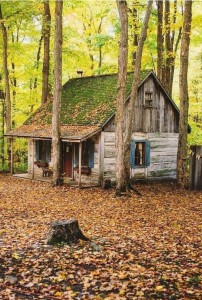
Good colors, and new chinking
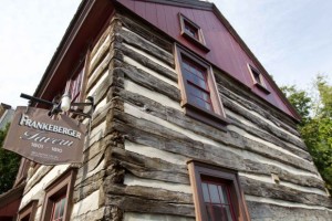
When choosing accent colors on a cabin you can’t go wrong in picking historic shades like we see here.
This cabin is very attractive and it’s obvious that it has experienced a recent restoration.
Unfortunately, the chinking was done improperly and as a result this cabin will be in need of major restoration (log replacements and re-chinked) in less than 10 years.
Here is a good example of properly installed chinking… notice how the chinking is recessed a bit from the faces of the logs allowing water to run off and not get behind the chinking and rot the logs. The folks that restored this cabin did however fall short with their modern finish treatment of the gable ends, and with the protruding window trim.
Originally posted 2015-10-02 11:20:10.
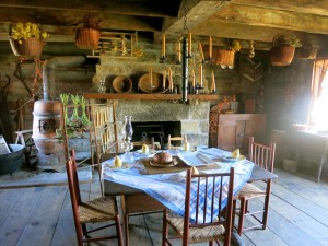
A nice window
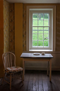
The simple elegance of a 6 over 9 pane window combined with aged wood flooring… oh my.
The most attractive windows are an odd number of panes wide… the panes need to be taller than they are wide… and all of the panes on a house, regardless of the size of the window unit, should be matching as close as possible in size and proportion.
Originally posted 2015-10-01 13:40:25.

